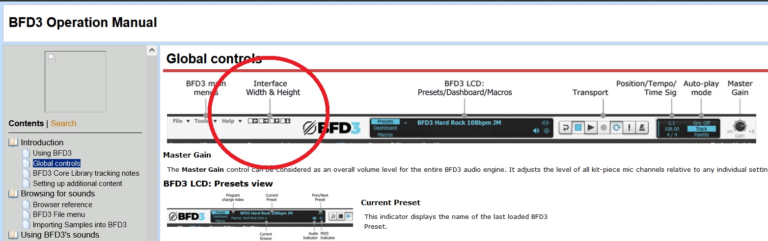
At the top left, after the File, Tools, and Help menu, there are 4 arrows: Left, Right, Up, Down.
Click these to increase or decrease how much screen space BFD takes up.
If this has always been there, I’m a doofus. I’ve been using it on its default size for years, wishing I could make it take up the whole screen so I can see more.
Yeah that was one of my WishList wishes. Nobody came back and said “look for the little arrows”. Seriously, I’ve been using this since it was released (started with BFD 1) and just today noticed these arrows.
My philosophy is that if it requires a manual, the UI needs work. I mean, the arrows were right there the whole time, but why? Why not the default Windows method with the little square between the underscore and the X?
And really I haven’t done much with the mixer. I stretch it out and see all the tweaks available and I’m like “YEESH!” and close it. If I need to tweak that much on the drum, I’m spending way too much time on it.
LOL…
I don’t believe anyone is “dumb” sometimes the simplest things get overlooked…
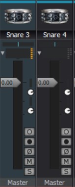
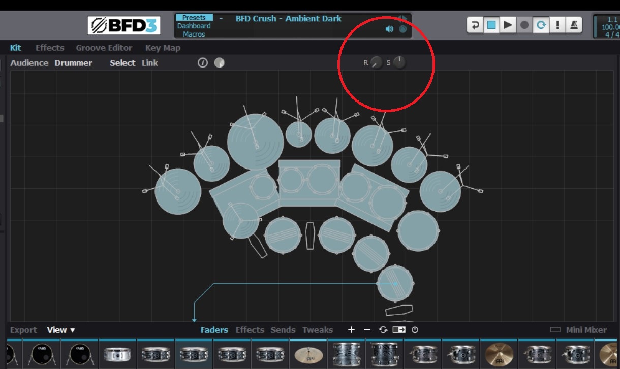
For the longest time I didn’t know what the tiny little boxes were for and why only visible on certain kits.
Since they were next to the Gain window I thought they were meters…
It turns out they are indicators for how many effects are on per channel and the Knobs are Trim Knobs and only visible if “Simple” is unchecked…
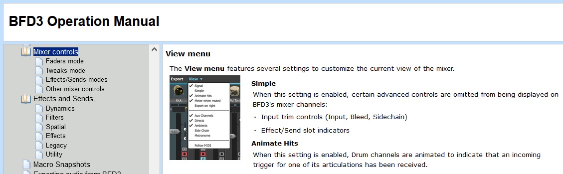
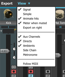
Simple When this setting is enabled, certain advanced controls are omitted from being displayed on BFD3’s mixer channels: •Input trim controls (Input, Bleed, Sidechain) •Effect/Send slot indicators
In the Kit View…Rotation and Scaling are “New” (not in the manual)
I read the manual as I went along initially. I remembered I had a few Groove3 trials, so I binged-watched/downloaded a lot of stuff, including Eli’s BFD3 tutorials. I think I still have them saved to my Dropbox if anyone wants to watch those.