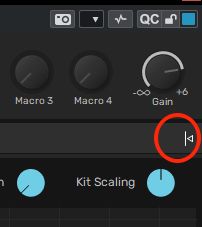
First some sections are way too hidden from sight.
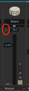
Those tiny little widgets are way too inconspicuous therefore easily skipped, got to be made more noticeable ! I had missed this panel for weeks!
Now to the big part. There are WAY too many areas to tweak stuff, it needs a complete reorganisation imo.
Having sections clearly is important, eg mapping, kit assembly, etc..
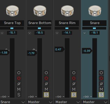
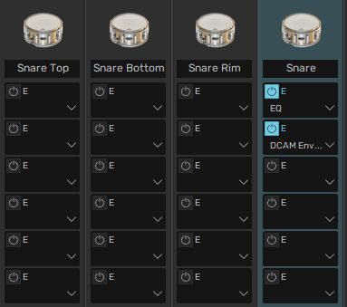
but for example “tweaking sounds” eg mixing more or less. Let’s take the example of tweaking a snare.
There are so many areas to tweak the snare !
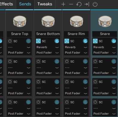
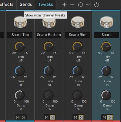
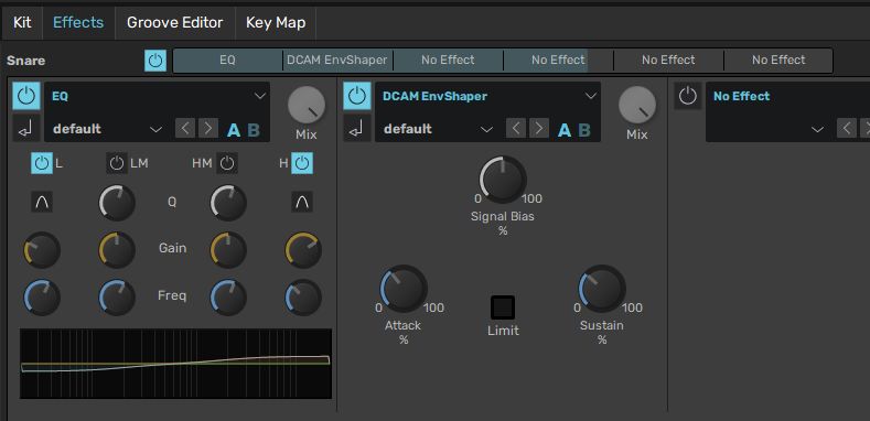
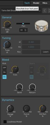
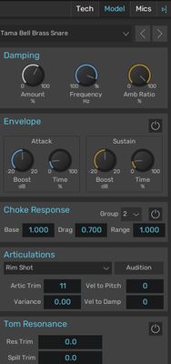
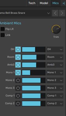
The faders area :
A grand total of EIGHT sections, 8 ! That is insanely laborious.
A much smoother workflow would be to gather these together.
I just take the example of the Cubase mixer. One panel, all sends and inserts and faders in one page.
That would simplify tweaking a lot, one page for most controls.
Perhaps the Tech Model and Mics panel can remain separate from the mixer. But at least that deserves a much clearer UI visual to guide users to see where to open it.
Actually as the top Kit section shows the graphic and is not dedicated to mixing, I would suggest to make that top section automatically open the Tech Model and Mics side panel.
Then it makes it more of a kit tweaking page with these 3 showing up. And hide them when going to other sections.
I don’t think anymore drastic revamping is gonna happen with BFD3 tbh. I’m not even sure the UI change with v3.5 was initially in the pipeline. They must’ve pushed back BFD4’s release date expectations and decided to focus on getting BFD3 refreshed and more stable on current platforms, as well as the issues with the older license manager.
There are a lot of redundant controls. I think the key is just figuring out which sections you prefer to use to tweak kits and just forget about the others.
The entire ethos of BFD has always been to give the user the most unprocessed detailed raw drum samples coupled with all the tools an engineer might wish for in a recording studio.
The fact that some people might not want, or know how to use all those features, doesn’t make it bloated.
There are plenty of features I don’t use, or need, but I wouldn’t swap BFD for any other drum vst out there, despite it’s quirks and bugs.
I think OP isn’t saying it’s bloated with too many different features, it’s that the same exact tools are present in multiple locations, which makes it redundant and confusing.
HI Steve, like Fender Bender mentioned above, I don’t suggest removing features, but improving the interface by better organising how the features are displayed.
Think about it as a great kitchen or garage workbench, if you can find your tools easily when and where you need them it does improve the workflow.
And currently BFD3.5 is a mess, 8 places to tweak a snare sound is a lot, can be improved.
I just tested IK Modo Drums yesterday for example, it does not have half as much customisation as BDF but the interface is laid out in a way clearer way, eg with a mixer view as I suggested.
While the UI could use some work, I believe the intent is to offer different options of achieving the same thing based on how different people work, or the task at hand. The tweaks are there and handy if I want to quickly adjust those items across the whole kit instead of piece by piece, I can adjust all sounds quickly, I see it like quick access to the prime items that speeds up workflow. Then I can dive deeper on the few sounds that may need more adjustment than gain, tune and damp - this makes kit set up fast. I have no issues or confusion with offering a different way to do things and it can be ignored if I don’t want to use it, having it there doesn’t take away anything from the software, in my opinion. There’s a learning curve for sure though, like the fader expansion can be easily missed for someone new to BFD, and that’s a big one to get the basic sound the way you want it.
The first two pictures you show are right on the money. Some features are way too hidden. I’ve always called this “needing ESP” for BFD. But your description is better.
when you say:
I don’t suggest removing features, but improving the interface by better organising how the features are displayed.
Think about it as a great kitchen or garage workbench, if you can find your tools easily when and where you need them it does improve the workflow.
I find this to be right on. Excellent analogy. I understand the concept of having millions of ways to tweak sounds, and that’s great. But there could be some improvement on making the UI more comprehensible.